The National Park manages over 85 million acres of land, and with this also comes the responsibility of managing search and rescue missions for those who get lost, injured, or pass away. This goes over a small portion of available mission data in 2017 and 2018, comparing the fatality rates between parks.
Data Used: https://www.arcgis.com/home/item.html?id=983c8463a7bb4237b63ad9f409ed75f4 & https://www.arcgis.com/home/item.html?id=d121683e85ae4d148efe984b16fbad7f
Read CSV File: csv_path <- "C:/Users/danas/Documents/School/Earth Systems R/data/" csv_name <- "20190724_Georeferenced_ABBRV_2018AnnualSAR_0.csv" csv_file <- paste(csv_path, csv_name, sep="") sar_csv <- read.csv(csv_file)
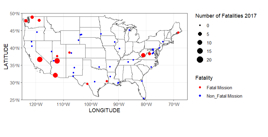
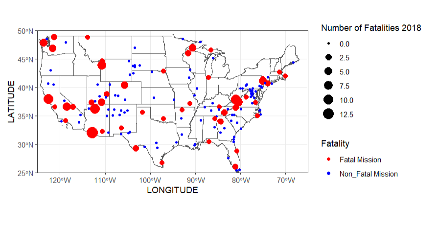
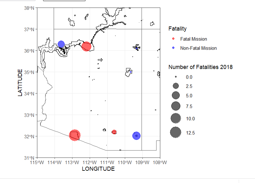
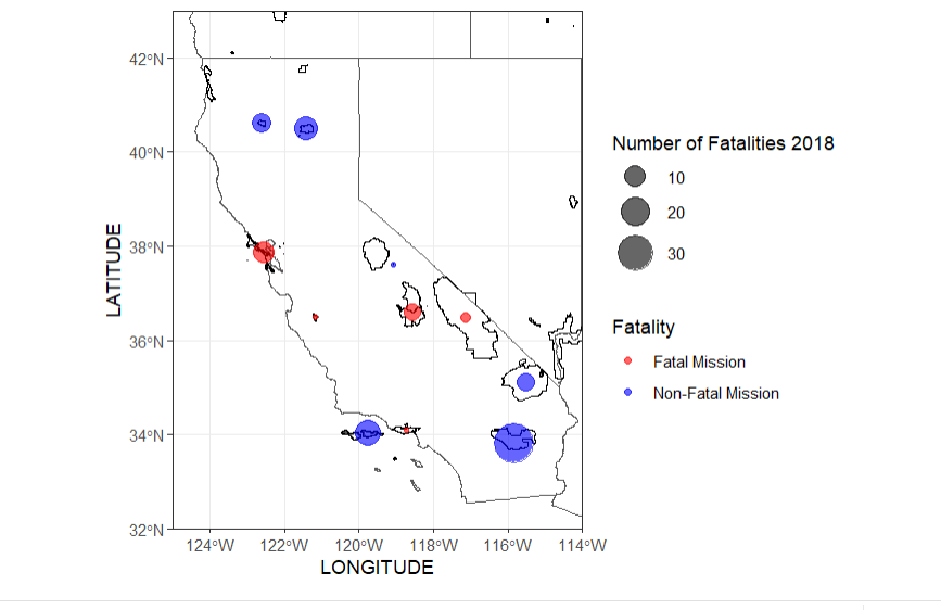
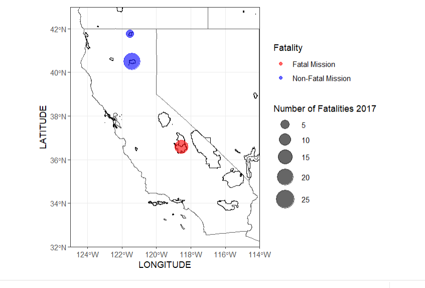
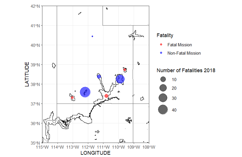
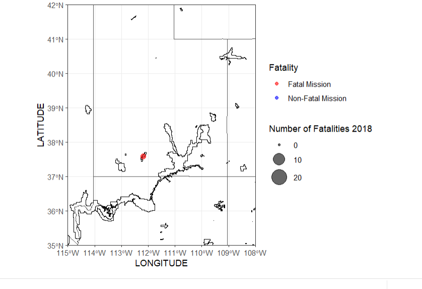
These two maps compare the amount of fatal missions across the US between the years of 2017-2018, there was an increase in fatalities and total missions amounts in 2018
us_states_sf <- st_read("C:/Users/danas/Documents/School/Earth Systems R/data/cb_2018_us_state_500k.shp") # Subset data based on fatalities subset_data <- subset(sar_csv, !is.na(Fatality)) # Plot ggplot() + geom_sf(data = us_states_sf, fill = NA) + geom_point(data = subset_data, aes(x = LONGITUDE, y = LATITUDE, size = Fatality, color = ifelse(Fatality == 0, "Non-Fatal", "Fatal"))) + scale_color_manual(name = "Fatality", values = c("Non-Fatal" = "blue", "Fatal" = "red"), labels = c("Fatal Mission", "Non_Fatal Mission")) + scale_size_continuous(name = "Number of Fatalities 2018") + coord_sf(xlim = c(-125, -65), ylim = c(25, 50), expand = FALSE) + theme_bw()
In 2018 the top states for missions were California: 385 Utah: 376 and Arizona: 298
In 2017 the top states for missions were California: 606 Nevada: 566 and Arizona: 343
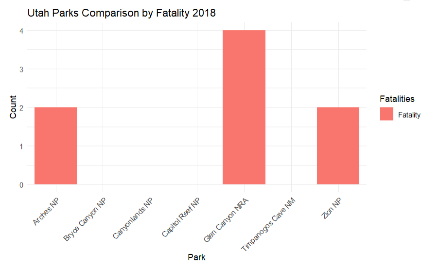
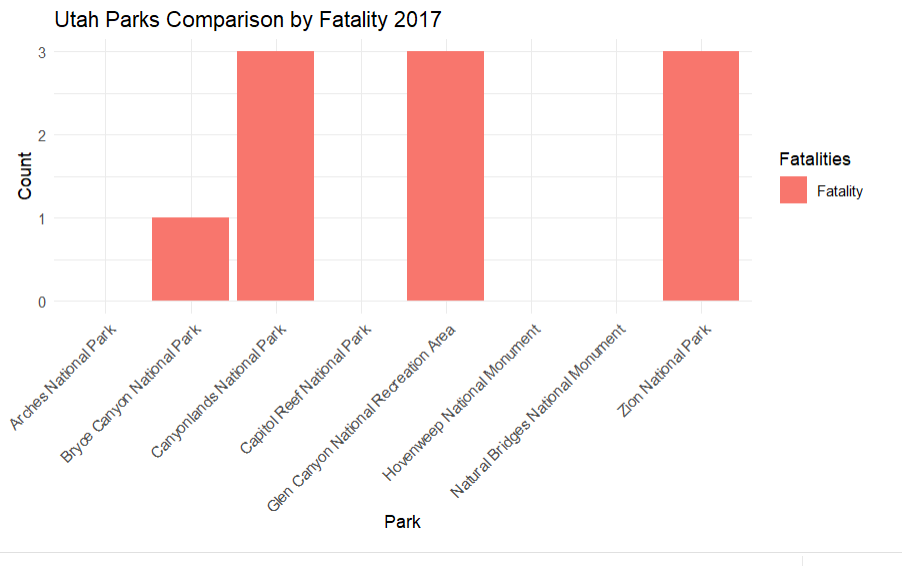
There may me a higher amount of missions in the top states in 2017, however more national parks had a higher amount of missions (fatal) in 2018. A higher amount of missions does not mean a higher fatality rate, because not every mission is fatal. This suggests that there was something that caused an increase in unsafe situations.
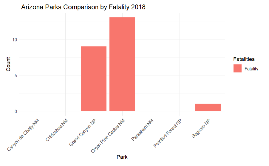
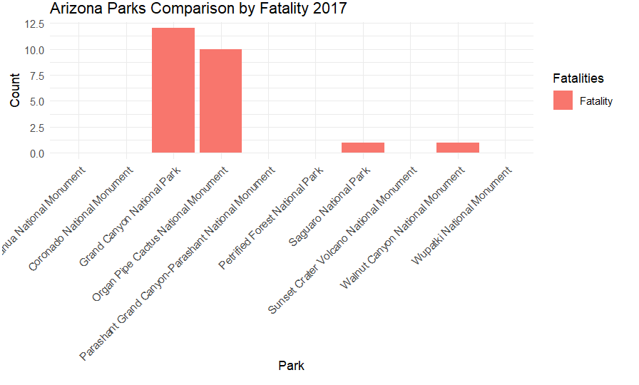
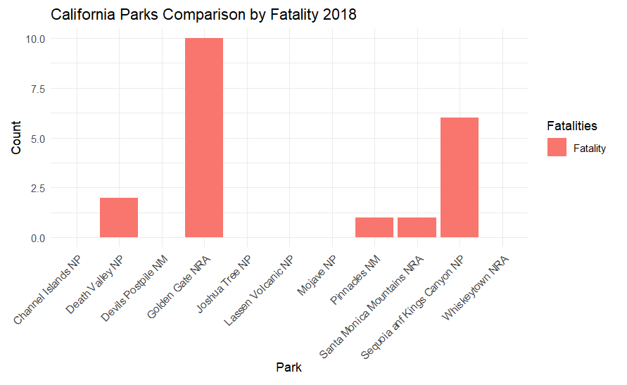
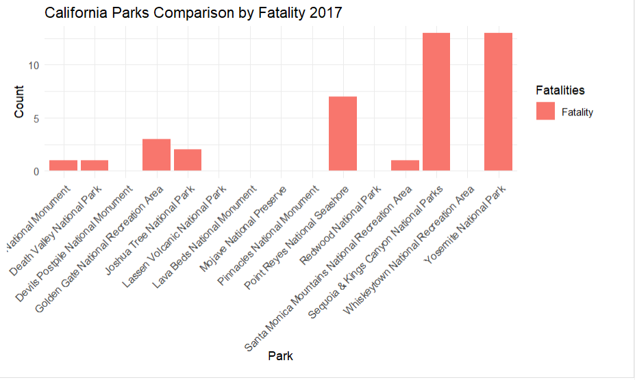
This displays the fataltiy data by park in the top states in two formats
az_data <- subset(sar_csv, State == "AZ") df <- data.frame(Park = az_data$Park, Fatality = az_data$Fatality) df_long <- pivot_longer(df, cols = "Fatality", names_to = "Fatalities", values_to = "Count") ggplot(df_long, aes(x = Park, y = Count, fill = Fatalities)) + geom_bar(stat = "identity", position = "dodge") + labs(title = " Arizona Parks Comparison by Fatality 2018", x = "Park", y = "Count") + theme_minimal() + theme(axis.text.x = element_text(angle = 45, hjust = 1))
nps_boundaries <- st_read("C:/Users/danas/Documents/School/Earth Systems R/final/nps_boundary.shp") # Filter SAR CSV data for California subset_data_az <- subset_data %>% filter(State == "AZ") # Plot ggplot() + geom_sf(data = us_states_sf, fill = NA) + geom_sf(data = nps_boundaries, fill = NA, color = "black", size = 0.5) + # Add national park boundaries geom_point(data = subset_data_az, aes(x = LONGITUDE, y = LATITUDE, size = ifelse(Fatality == 0, Total, Fatality), color = ifelse(Fatality == 0, "Non-Fatal", "Fatal")), alpha = 0.6) + # Add transparency for better visualization scale_color_manual(name = "Fatality", values = c("Non-Fatal" = "blue", "Fatal" = "red"), labels = c("Fatal Mission", "Non-Fatal Mission")) + scale_size_continuous(name = "Number of Fatalities 2018", range = c(1, 10)) + # Adjust size range coord_sf(xlim = c(-115, -108), ylim = c(31, 38), expand = FALSE) + theme_bw()
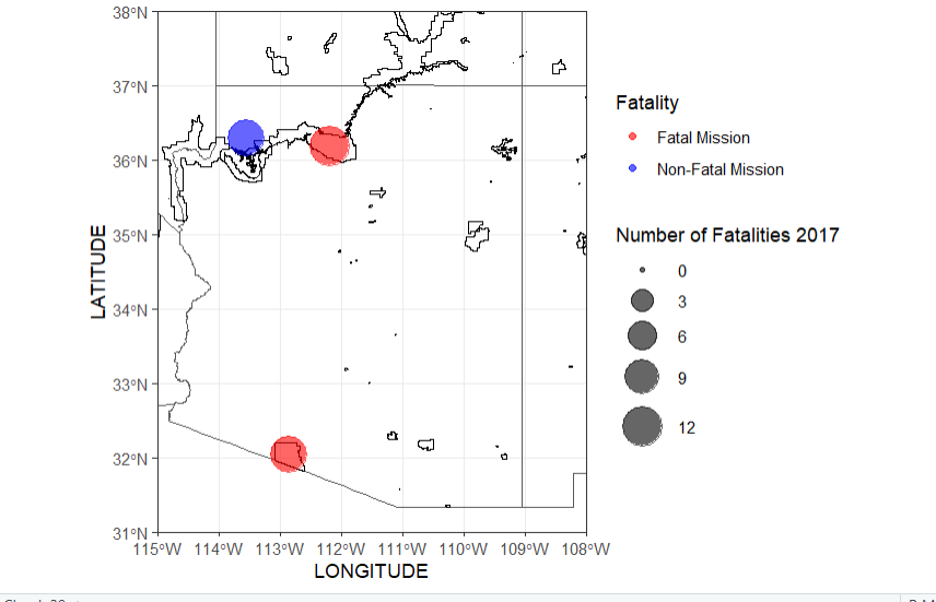
Same code was used as AZ, just with different state and zoom
Same code was used as AZ, just with different state and zoom
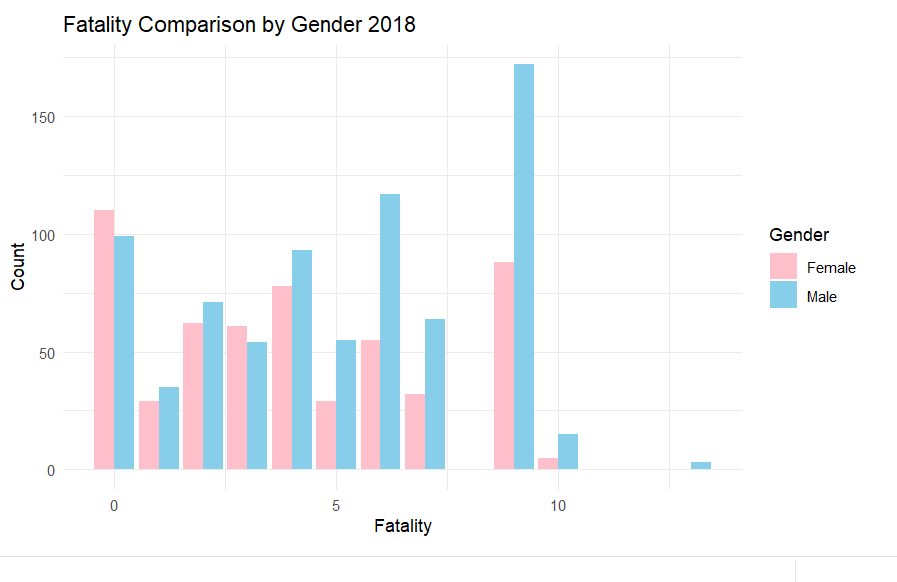
This is looking at the differences in fatality between gender, there is a slight overall hihger amount of men who die in the parks
df <- data.frame(sar_csv$Fatality, sar_csv$Male, sar_csv$Female) colnames(df) <- c("Fatality", "Male", "Female") df_long <- pivot_longer(df, cols = c("Male", "Female"), names_to = "Gender", values_to = "Count") ggplot(df_long, aes(x = Fatality, y = Count, fill = Gender)) + geom_bar(stat = "identity", position = "dodge") + labs(title = "Fatality Comparison by Gender 2018", x = "Fatality", y = "Count") + scale_fill_manual(values = c("Male" = "skyblue", "Female" = "pink")) + theme_minimal()
Using a chi sqaured test between the two years fatalities, the p values came out to be extremely small meaning that we reject the null hypothesis, indicating that there is a signifcant association between fatality rates in 2017 to 2018
contingency_table_2017 <- table(sar_csv_2017$Fatality) contingency_table_2018 <- table(sar_csv$Fatality) # Perform Chi-squared tests for each dataset separately chi_squared_test_2017 <- chisq.test(contingency_table_2017) chi_squared_test_2018 <- chisq.test(contingency_table_2018) # Print the Chi-squared test results print(chi_squared_test_2017) print(chi_squared_test_2018)
Chi-squared test for given probabilities data: contingency_table_2017 X-squared = 810.62, df = 11, p-value < 2.2e-16 Chi-squared test for given probabilities data: contingency_table_2018 X-squared = 727.13, df = 10, p-value < 2.2e-16